Most of us open a company’s website for the first time on a phone: from a search result, a social media ad or a link a friend sent. More than half of the world’s web traffic already comes from mobile devices. Yet many business websites are still designed for a computer screen first, with the phone version left as a compromise fixed afterwards.
In this article, we look at what responsiveness and mobile-friendliness mean, why Google puts weight on them and how you can check the state of your own site in a few minutes.
What does responsiveness mean?
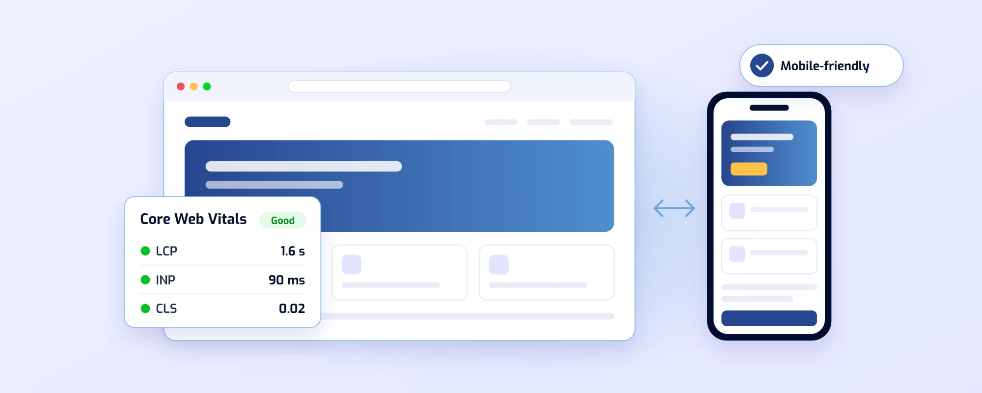
A responsive site automatically adapts to the screen size. The same page and the same content are shown on every device, but the layout changes: columns that sit side by side on a computer stack on top of each other on a phone, the menu collapses behind a menu button and images scale to the width of the screen.
Mobile-friendliness is a slightly broader concept. A page can technically adapt to a small screen and still be awkward to use: the buttons are too small, the text needs zooming or the form is painful to fill in with a finger. A mobile-friendly site is designed on the phone user’s terms.
Google assesses your site based on its mobile version
Google uses what is called mobile-first indexing. This means Google reads and assesses your site as it appears on a phone, and that version also determines your ranking in searches made on a computer (Google: mobile-first indexing).
In practice, this has two consequences:
- All important content must also be on mobile. If you hide text, images or service descriptions from the phone view, Google may not take them into account at all.
- The mobile experience affects your ranking. Google measures the user experience of pages with the Core Web Vitals metrics, and a poor mobile experience can drop a page behind a competitor in the search results.
Core Web Vitals in brief
Core Web Vitals are three Google metrics that describe what using a page actually feels like. The thresholds for a good score are:
- LCP (Largest Contentful Paint): the page’s main content appears in under 2.5 seconds.
- INP (Interaction to Next Paint): the page responds to taps and clicks in under 200 milliseconds.
- CLS (Cumulative Layout Shift): content doesn’t jump around while loading, i.e. the value is below 0.1.
On a phone these are harder to meet than on a computer, because the devices are slower and mobile connections vary. That is why a site that feels fast at the office can feel sluggish on a phone.
What makes a page mobile-friendly?
- Text you can read without zooming. A body text size of around 16 pixels is a good starting point, and lines need to be short enough.
- Buttons that are big enough. A finger is less precise than a mouse pointer. A touch area of about 48 × 48 pixels and enough space between buttons prevent mis-taps.
- Lightweight images. There is no point sending computer-sized images to a phone. Modern image formats such as AVIF and WebP, and image versions that fit the screen size, speed up loading considerably.
- A clear menu. The most important pages are a couple of taps away, and contacting you is always easy.
- Forms made for fingers. The right field types open the right keyboard on a phone, for example the number pad for a phone number.
- No intrusive pop-ups. A full-screen ad or newsletter window as soon as someone arrives on the page annoys the user, and Google takes it into account in its assessment too.
Accessibility goes hand in hand with mobile
Many principles of mobile-friendliness are also accessibility: a sufficient text size, clear contrast and large touch areas help all users, including those with visual or motor impairments. Since June 2025, accessibility requirements have also applied to many online services sold to consumers, such as webstores. Micro-enterprises are excluded from the requirements, but an accessible site is a good goal whatever the size of the business.
How to check your own site
- Open your site on your own phone. Go through the most important pages and try filling in the contact form. If something frustrates you, it frustrates your customers too.
- Run a PageSpeed Insights test. It shows the Core Web Vitals results and tells you what slows the page down on a phone.
- Look at the Search Console reports. Google Search Console tells you which pages have user experience problems, based on data from real visitors.
- Test different screen sizes. In device mode in Chrome’s developer tools, you can preview your site on different phones and tablets.
Summary
Responsiveness is no longer an extra feature but a basic requirement for a website. Google assesses your site based on its phone version, and so do your customers. A fast, clear site that is easy to use with a finger improves both your search visibility and how many visitors end up getting in touch.
If your own site’s test results came back red, we are happy to help. We design every site mobile first, and they work as well on a phone as on a computer.